← All case studies
Realize Solution · Cooperatives (co-ops)
CoopVota: A Resolution System for Co-ops
Designed to enhance decision-making in co-ops and similar organizations.
My role
What I was responsible for on this engagement.
UX Researcher and UX Designer. I focused on the research and contributed to the UX design.
The client
Who they are, and the problem they brought.
Realize Solution is a team of strategic thinkers who combine data, research, deep experience, and a network of solvers to design outcome-oriented solutions for organizations with leadership, governance, and strategy challenges. The brief was to design a prototype for a resolution system that enhances engagement, flexibility, and transparency in the decision-making process for cooperatives — organizations where all members have one vote and are governed by a board of directors, which makes the decision process itself the product rather than a feature of it.
🚨
The problem — Cooperatives and similar organizations struggle with inefficient decision-making, poor resolution management, and low member engagement due to limitations in current tools and a lack of motivation to participate.
Client
Realize Solution
Industry
Cooperatives (co-ops)
Role
UX Researcher and UX Designer
Timeline
2024
Methods
Desk research, Competitor analysis, Potential-user segmentation, Expert interview
How I researched it
Four methods, and what each one actually surfaced.
🔍
Desk research — co-operative business models — I started by learning about cooperative business models in comparison with other models. In co-ops, all members have one vote and they are governed by a board of directors. The literature also named the recurring problems: low member participation, lack of trust, untrained leaders, and limited awareness of cooperative benefits.
🔍
Competitor analysis — I analysed six competitors, direct and indirect — Loomio, Kialo, NationBuilder, Consul, Helios Voting and Decidim — across ten criteria including task delegation, anonymous voting, version history and democratic decision-making. It showed there is still room for improvement in democratic decision-making, task delegation, user-friendly tools, group engagement and building trust.
🔍
Potential users — I segmented the audience rather than assuming one. Primary: cooperatives, split into platform co-ops with high tech acceptance and mainstream co-ops still voting at annual general meetings. Secondary: B Corps, employee-owned companies, NGOs, educational institutions, local government, trade unions and start-ups.
🔍
Expert interview — A one-hour unmoderated remote session with Danny Spitzberg, a UX researcher specializing in the cooperative economy, on choosing tools for democratic governance. Three things came out of it: people want to see where they stand on a decision, and a small visual does that better than a wall of comments; the facilitator is the core user of a governance tool; and everything before a decision is some form of discussion.
From findings to decisions
How the research was synthesised, and what it produced.
The project ran as a full design process — Understand, Research, Define, Design, Presentation — not a design sprint. Research was front-loaded across the first two phases; we spent 80% of project time on it.
I synthesised primary and secondary research into an empathy map, which surfaced a gap between what members do and how they feel: they propose resolutions and join discussions, but remain unsure where they stand in the process. That became five pain points — lack of transparency in decision-making, difficulty tracking follow-through, no long-term engagement on the app, difficulty prioritising resolutions for leadership, and lack of standardisation.
Two personas carried those pain points forward. Nolan, 45, sits on a service-based co-op’s steering committee and needs a dashboard to analyse member participation; his frustration is that a lack of collaboration leaves resolutions unfinished. Lucy, 27, is a co-op member who misses voting deadlines and wants to discuss a resolution before voting; messy interfaces caused by disorganised debates confuse her.
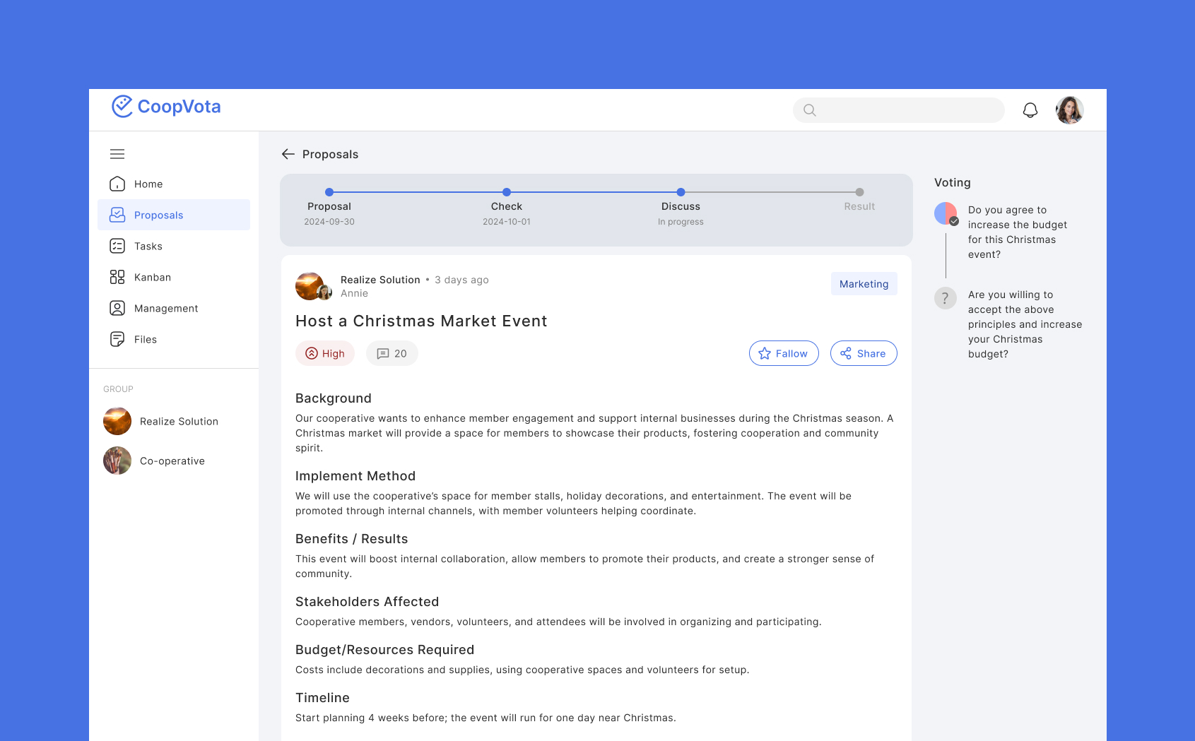
The user journey mapped four stages: a proposal is submitted, then discussed and refined, then voted upon once quorum is reached, then approved and implemented or rejected with feedback. That journey became the product’s information architecture almost one-to-one.
Key finding and what it changed
The insight that shaped the product, and the design it produced.
💡
Key finding — People want to see where they stand on a decision, and a small visual does that better than a wall of comments. And everything before a decision is some form of discussion — so discussion needed its own stage, before the vote.
📈
What the research changed — Three design consequences: discussion got its own stage between proposal and vote; the voting screen carries an agree / abstain / disagree breakdown as a visual rather than a comment thread; and proposals pass an administrator review gate before entering discussion.
The design output: low-fidelity solutions for Proposals and Tasks, an information architecture and user flow, and high-fidelity wireframes for the Home dashboard, Proposals, Proposals with voting, All Tasks, By Proposals and viewing mode. The logo is composed of C+V, which also reads as the check icon of voting.
Let's work together
The fastest way to reach me is LinkedIn. Send a note about what you are working on and what is not working about it — that is usually enough for me to tell you whether I can help.
Connect on LinkedIn ↗
© 2026 Hasty Haghkhah
Designed in Figma
← All case studies
Realize Solution · Cooperatives (co-ops)
CoopVota: A Resolution System for Co-ops
Designed to enhance decision-making in co-ops and similar organizations.
My role
What I was responsible for on this engagement.
UX Researcher and UX Designer. I focused on the research and contributed to the UX design.
The client
Who they are, and the problem they brought.
Realize Solution is a team of strategic thinkers who combine data, research, deep experience, and a network of solvers to design outcome-oriented solutions for organizations with leadership, governance, and strategy challenges. The brief was to design a prototype for a resolution system that enhances engagement, flexibility, and transparency in the decision-making process for cooperatives — organizations where all members have one vote and are governed by a board of directors, which makes the decision process itself the product rather than a feature of it.
🚨
The problem — Cooperatives and similar organizations struggle with inefficient decision-making, poor resolution management, and low member engagement due to limitations in current tools and a lack of motivation to participate.
Client
Realize Solution
Industry
Cooperatives (co-ops)
Role
UX Researcher and UX Designer
Timeline
2024
Methods
Desk research, Competitor analysis, Potential-user segmentation, Expert interview
How I researched it
Four methods, and what each one actually surfaced.
🔍
Desk research — co-operative business models — I started by learning about cooperative business models in comparison with other models. In co-ops, all members have one vote and they are governed by a board of directors. The literature also named the recurring problems: low member participation, lack of trust, untrained leaders, and limited awareness of cooperative benefits.
🔍
Competitor analysis — I analysed six competitors, direct and indirect — Loomio, Kialo, NationBuilder, Consul, Helios Voting and Decidim — across ten criteria including task delegation, anonymous voting, version history and democratic decision-making. It showed there is still room for improvement in democratic decision-making, task delegation, user-friendly tools, group engagement and building trust.
🔍
Potential users — I segmented the audience rather than assuming one. Primary: cooperatives, split into platform co-ops with high tech acceptance and mainstream co-ops still voting at annual general meetings. Secondary: B Corps, employee-owned companies, NGOs, educational institutions, local government, trade unions and start-ups.
🔍
Expert interview — A one-hour unmoderated remote session with Danny Spitzberg, a UX researcher specializing in the cooperative economy, on choosing tools for democratic governance. Three things came out of it: people want to see where they stand on a decision, and a small visual does that better than a wall of comments; the facilitator is the core user of a governance tool; and everything before a decision is some form of discussion.
From findings to decisions
How the research was synthesised, and what it produced.
The project ran as a full design process — Understand, Research, Define, Design, Presentation — not a design sprint. Research was front-loaded across the first two phases; we spent 80% of project time on it.
I synthesised primary and secondary research into an empathy map, which surfaced a gap between what members do and how they feel: they propose resolutions and join discussions, but remain unsure where they stand in the process. That became five pain points — lack of transparency in decision-making, difficulty tracking follow-through, no long-term engagement on the app, difficulty prioritising resolutions for leadership, and lack of standardisation.
Two personas carried those pain points forward. Nolan, 45, sits on a service-based co-op’s steering committee and needs a dashboard to analyse member participation; his frustration is that a lack of collaboration leaves resolutions unfinished. Lucy, 27, is a co-op member who misses voting deadlines and wants to discuss a resolution before voting; messy interfaces caused by disorganised debates confuse her.
The user journey mapped four stages: a proposal is submitted, then discussed and refined, then voted upon once quorum is reached, then approved and implemented or rejected with feedback. That journey became the product’s information architecture almost one-to-one.
Key finding and what it changed
The insight that shaped the product, and the design it produced.
💡
Key finding — People want to see where they stand on a decision, and a small visual does that better than a wall of comments. And everything before a decision is some form of discussion — so discussion needed its own stage, before the vote.
📈
What the research changed — Three design consequences: discussion got its own stage between proposal and vote; the voting screen carries an agree / abstain / disagree breakdown as a visual rather than a comment thread; and proposals pass an administrator review gate before entering discussion.
The design output: low-fidelity solutions for Proposals and Tasks, an information architecture and user flow, and high-fidelity wireframes for the Home dashboard, Proposals, Proposals with voting, All Tasks, By Proposals and viewing mode. The logo is composed of C+V, which also reads as the check icon of voting.
Let's work together
The fastest way to reach me is LinkedIn.
Connect on LinkedIn ↗
© 2026 Hasty Haghkhah
Designed in Figma